I know... You're thinking to yourself: How does he make such awesome normal distribution curves for those illustrations on this blog? He can't be drawing them by hand! Well, I learned the basics from Gary Andrus's web page, and then I modified his method to make it more general and a bit faster.
Here's how I do it using MS Excel 2003 (and I'll even throw in a few nice Excel tricks too):
Step 2: In cell B1 enter =NORMDIST(A1,0,1,0). This tells Excel to calculate the value of the normal distribution PDF for the value in A1 (which is -4) for a normal distribution with mean of 0 and standard deviation 1. I.e. the standard normal distribution. You can fiddle with those values if you want a different normal distribution. The last 0 tells it to use the probability distribution function, not the cumulative distribution function (you overachievers can try using 1 as your last value for extra credit).

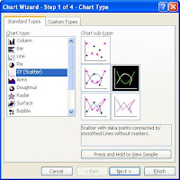
Step 4: I usually make it look a little bit nice by right-clicking the x-axis, selecting Format Axis, and in the Scale tab changing the Minimum and Maximum to -4 and 4 respectively. I also right-click the graph line itself, select Format Data Series, and in the Patterns tab I give the line a heavier Weight than the default so it stands out better.
Tuesday, February 19, 2008
Graphing the Normal Distribution Curve with Excel
Posted by Eliezer at Tuesday, February 19, 2008
Tags: Fun stuff
Subscribe to:
Post Comments (Atom)

3 comments:
Great help! You explained this quick and easy! Thanks!!!
Thanks a lot. Im so happy to see my data taking chart form...!!!
cheers
Tanmay
Thanks a lot...I can't be more happy seeing my data taking chart form...!!!
Post a Comment